Thursday, December 6, 2012
Tuesday, December 4, 2012
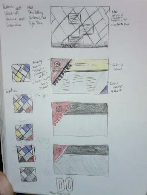
Encode Designer Website: Reimagining Design
The bottom screen shot above is my new preference. It keeps the title of the page clean and classy, while bringing in the color & angular elements Van Doesburg is known for. It's not as overtly geometric as I ideally wanted, but it may actually read better this way.
Encode Designer Website: Coding & Troubleshooting
In spite of layout troubles, I worked more on the branding for the site. Here is the completed logo/title for the webpage.
Tuesday, November 27, 2012
Encode Designer Website: Further Sketches
During class began with a quick review of HTML & CSS basics and a group meeting with the professor. I spent the rest of the class furthering my sketches (focusing on my second page design), exploring color, texture, & typography, & brainstorming branding for the site.
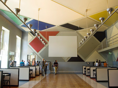
The page layout & color is abstractly based on Van Doesburg's Contra-Composition XVI, as I have previously exhibited, with some inspiration the Cinebal, a dance hall he designed.
The page layout & color is abstractly based on Van Doesburg's Contra-Composition XVI, as I have previously exhibited, with some inspiration the Cinebal, a dance hall he designed.
The logo, which will be embedded within the title design, is also based on his Contra-Composition XVI, though much more literally. I have yet decided if I want a full color version for the logo, or a more black & white line drawing.
Also for the title, I'm looking at Van Doesburg's Kleine Dad Soiree for typographical inspiration. Interestingly enough, it wasn't until after I fell in love with this Dada lettering that I discovered it was also the work of Van Doesburg.
Tuesday, November 20, 2012
Encode Designer Website: Theo van Doesburg Research
Theo van Doesburg was a Dutch artist active in painting, prose, poetry, & architecture in the early 20th century avant garde. He is best known as the founder of the Dutch art movement De Stijl, also known as neoplasticism and characterized by the simplicity & abstraction achieved through stark use of lines, diagonals, & bright rectangular forms. He was also associated with Concretism & Dadaism.
Van Doesburg's Contra-Composition XVI
Tuesday, November 13, 2012
HTML Coding Exercise: My "First" Website
Not actually my first website, I redid an activity I did in my web design class to further practice the basics of internet coding. It was quite helpful (especially with the huge undertaking of designing an entire webpage in my other class) to go back & practice these concepts in a less stressful assignment.
Below is a picture of the finished "web page" & its HTML code.
Magazine Project: Final Critique & Revised Cover
Critiques took place Thursday. After the critique, we were given the opportunity to make changes to better our design. One comment that was prominent in the critique of my piece was that there were too many elements vying for attention. In my re-design, I took out the chalk drawing a the glass of orange juice and replaced it with a less intrusive red glow with lightning bolts & rays. Lesser elements like articles & the top bar were moved slightly, as well as the masthead slightly tweaked for better alignment.
Thursday, November 8, 2012
Magazine Project: Final
Yesterday I brought all of my imagery into InDesign & tweaked the existing type. Here's my composite image I brought in...
And here is the completed cover...
The type for the featured articles alludes to chalk drawing. The emphasis of green not only references the "organic living" theme of the magazine, but also helps cool down the warm colors of the imagery.
Magazine Project: Additional Background Imagery
With my OJ/lightbulb composite finished, I decided I needed something more in the background than just a flat color field. Referencing Whole Foods website, I decided for a chalk board background, also lending homage to cafes and coffeehouses everywhere.
I spent a few hours doing several ideations & variation thereof. Unfortunately, my memory card was corrupted, but here are a few that survived.
This final one I chose to be my background. I thought the proportions were most appropriate and the macro detail of the orange juice better rendered.
Thursday, November 1, 2012
Magazine Project: Imagery
Captured image: Orange juice
Scanned magazine image: Lightbulb, Wired Magazine
The above are my two main images. I'm currently working on integrating them into a composite image, a lightbulb filled with orange juice.
A preview.... sans the WIRED masthead, of course.
I'm going for the same idea of a flat background on which the bulb can lay, though after some research I think perhaps a lightly textured background could add more effectiveness. Thanks to The Spoon Magazine for some texture inspiration.
Here's a small, simple sketch of what I plan for the magazine cover to look like.
Magazine Project: Masthead
Above is my completed masthead. The underlying typeface is Poplar Standard Black, with a leaf embellishment for the "i" for a green sensibility. The slight curvature of the "R" (as well as the leaf) against the stolid straight angles of the rest of the word lend to a modern, hip feel.
Tuesday, October 30, 2012
Magazine Project: Slight Redirection/Specification
With the advisement of my professor, I'm slightly altering my proposed magazine topic--well, rather narrowing it down. I will be leaning more the way of the "Whole Foods" culture. Below is a re-concentration of my focus questions.
Who is the target audience?
While still a food-related magazine for non-moms, more urban singles or young couples who are more into out-on-the-town consumption that domestic homemaking, focusing in more on the subculture into organic groceries and products with enough expendable cash to afford those luxuries.
What is the name of your magazine? Why? Connotations?
I'm still pretty solid on RELISH. As I said previously, the word is known primarily as chopped pickle used to top dishes, but also means liking the taste of something or a pleasing flavor/quality. I think RELISH also emanates a more organic/green feel than, say, FEAST.
What will your masthead look like? Any idea for fonts?
The second sampled typeface in my previous post is my top pick. I will most likely be doing an Illustrator-based type treatment to further sell an organic feel.
What images will be on the cover & why?
Still searching for an appropriate found image. Really wanting some nice macro imagery as reflected in my mood board.
What will be your sell lines to entice your target audience?
"Organic Living for Urban Folk"
Thursday, October 25, 2012
Tuesday, October 23, 2012
Magazine Project: Digital Sketching
Monday, October 22, 2012
Magazine Project: Mood Board & Focus Questions
Who is the target audience?
I think I'd like to be designing a food-related magazine for non-moms, more urban singles or young couples who are more into out-on-the-town consumption that domestic homemaking.
What is the name of your magazine? Why? Connotations?
The jury is still out on that. I want something simple that emanates similarly to FEAST. I'm thinking RELISH may be good. Known primarily chopped pickle used to top dishes, it also means liking the taste of something or a pleasing flavor/quality.
What will your masthead look like? Any idea for fonts?
As much as I thought I wanted to do syrup, I think that idea may more more appropriate for the feature title on the cover. The masthead will probably be a much simpler, more bold font.
What images will be on the cover & why?
Macro imagery; probably close-up of waffle & syrup on plate.
What will be your sell lines to entice your target audience?
Food is not enough?
Thursday, October 18, 2012
Magazine Project: Preliminary Mindmapping
Our classmates chose the words waffles and phobia to be our basis for our group's magazines. I'm leaning towards the waffles direction, perhaps making a more designerly cooking magazine (admit it, they can be a little dry).
Monday, October 15, 2012
Types of Images Exercise
Practicing bitmaps, grayscales, duotones & color modes in Photoshop, as well as a review of line/vector art in Illustrator. The goal was to copy & complete a model table. My version can be seen below.
Thursday, October 4, 2012
Tuesday, October 2, 2012
Seed Packet Project: Pre-Final Progress & Tweaks
At this point in my design process, it is mostly tweaks, but I did add a considerably big detail. On the circular Ol' Dusty's label I added stitch-like detail, thanks to a great suggestion.
Another minor tweak I tried (but ultimately rejected) was minimizing the use of my script typeface in the product description. I thought it did not bring enough emphasis to the words I wished to highlight, especially since my color palette is more toned-down, earthy, & even a little dirty. I feel the use of the typewriter & script typefaces together effectively alludes to early 20th century advertising & creates pleasing variety.
Subscribe to:
Comments (Atom)


